

Free Mockup
Fill out the form below & we'll show you how your finished product will look.
Once the form is submitted we will get a mockup to you within 24 hours (except on weekends or holidays)
We're looking for files that are black and white with no shades of grey. If you currently don't have this version of your logo, submit what you have and we'll do our best to get it where it needs to be.
Before submitting an AI generated design, read this...
- We're not looking for a mockup of your design, we need the high resolution, black and white with no shades of grey file.
- AI often creates elaborate designs, crammed full with super fine detail and small text. If this is the case, the text is probably too small to be legible and the shading will be blended together into mush. Think about how small everything will end up being when put on a token. The designs shouldn't be crowded and the text shouldn't be tiny.
- Somehow, AI has trouble making perfectly round designs. They're often more tall than wide or vice versa by a tiny amount. It's not noticeable because they put the irregularly shaped design inside an equally irregularly shaped token. We take that design and put it inside our perfectly round tokens. It's easy to overlook in the software, but easy to see the unequal gaps in real life.
- Please, please, do not send us a one or two page pdf created by ai with a laundry list of requirements. Often things we don't (typically) do and often things that aren't a concern or requirement of yours. We don't want to know about the 5 different nearly identical fonts in use and their weights. We don't round the edges of our tokens. Specifying the depth of engravings to the tenth of a mm is unrealistic. We just want the design, not a laundry list of add-ons and extras you probably didn't even consider until ai filled your mind with it.
Use this AI Prompt
Generate a flat, high-resolution 2D graphic of [INSERT SUBJECT HERE]. Deliver this strictly as a standard image file (PNG), absolutely no PDFs, SVGs, or AI files, and do not include any text spec sheets, dimensions, or laundry lists of requirements—I just want the raw design itself. The image must be purely solid black (#000000) on a purely solid white (#FFFFFF) background. There can be zero shades of grey, zero gradients, zero halftones, and zero shading. Use an exact 1:1 aspect ratio. Do NOT draw any borders, or outlines; the design should float freely. Do not create an elaborate, crowded design with super fine details or thin lines, as this will be scaled down to a small size. All white negative space surrounded by black (reverse engraved areas) must be heavily exaggerated, large, and thick so it does not get lost. If text is included, it cannot be tiny. You must use fonts with adequate spacing (wide kerning) and avoid small, open inner spaces (counters). Do not use highly compressed or excessively thick fonts. Do not render this as a mockup, physical object, or place it on a wood background.
If you want the best quality engraving, read this...
- We always advise against a border on both sides of a token because of the movement of the wood which is amplified by the heat from the laser beam and the air that's constantly blowing on one surface of the wood. This accelerated expansion and contraction of the wood makes it impossible for the design to be perfectly centered on both sides. And borders are what make this noticeable. A border on one side is fine; we can always make sure the design is centered to the side with a border when cutting. The slight bit it's off center on the other side won't be noticeable when it lacks a border.
- Thin borders should be avoided. Thicker borders are more forgiving to our eyes whereas thin borders highlight imperfections...I don't know why, but it's true.
- Images inside pdf files don't trace well at all and we can't do anything with them. They get compressed and become a Rorschach inkblot when traced. You'll need strong perception to see anything when gazing at these traced inkblots. Always just give us the image itself, not a pdf, svg, or ai file with a png or jpg inside it.
- Non-engraved areas surrounded on all sides by engraved areas (reverse engraved) should not be thin or small or they will get lost. Reverse engraved areas should be larger and thicker to stand out well.
- Think about all the islands or reverse engravings that exist in text. Inside letters like R, Q, P and D (these are called counters) and the spacing between letters (kerning). Avoid fonts with small counters and kerning, such as very thick &/or compressed fonts. They get muddied as the unengraved "islands" become lost. Below is a super exaggerated example of a font which would not engrave well.
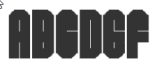
Stick to fonts and designs with adequate spacing & bigger counters (more whitespace) for more clear and legible engravings. The below font does engrave well.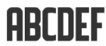
- Think about all the islands or reverse engravings that exist in text. Inside letters like R, Q, P and D (these are called counters) and the spacing between letters (kerning). Avoid fonts with small counters and kerning, such as very thick &/or compressed fonts. They get muddied as the unengraved "islands" become lost. Below is a super exaggerated example of a font which would not engrave well.